I’m excited to share our most recent projects here today. It’s no secret that we love modern design here at Lagnappe, and, of course, we’re always putting our own tropical spin on modern for our clients here in the USVI.
When this homeowner called us about a new home she was purchasing, I had an instant connection. To start with, I’m familiar with the house and know the sellers (it is a small island after all), but when she said she’s originally from Trinidad (I love it there, can’t wait to get back) and loves mid-century design, well I knew we’d have to jump in. The house has always whispered mid-century to me, but only in a whisper… I knew it had the potential to move a little more toward mid-century style. Although, being in the Caribbean with a new owner who has traveled the world and is now reconnecting with her Caribbean roots, well, I had an “I can see it now moment!”
So how did we style this lovely home? Let me give you the tour!
We’ll Start with the Entry/Living Area
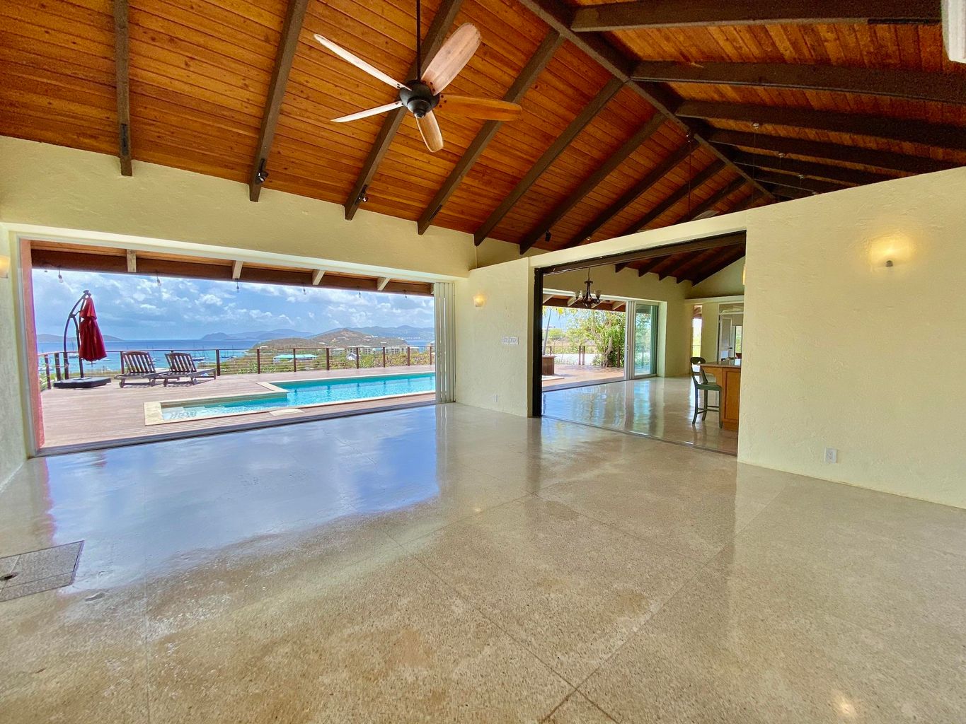
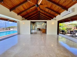
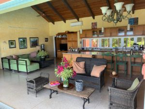
It’s a great entryway. It welcomes you straight into the house and highlights the view and the pool. It just needs furnishing and styling, right?
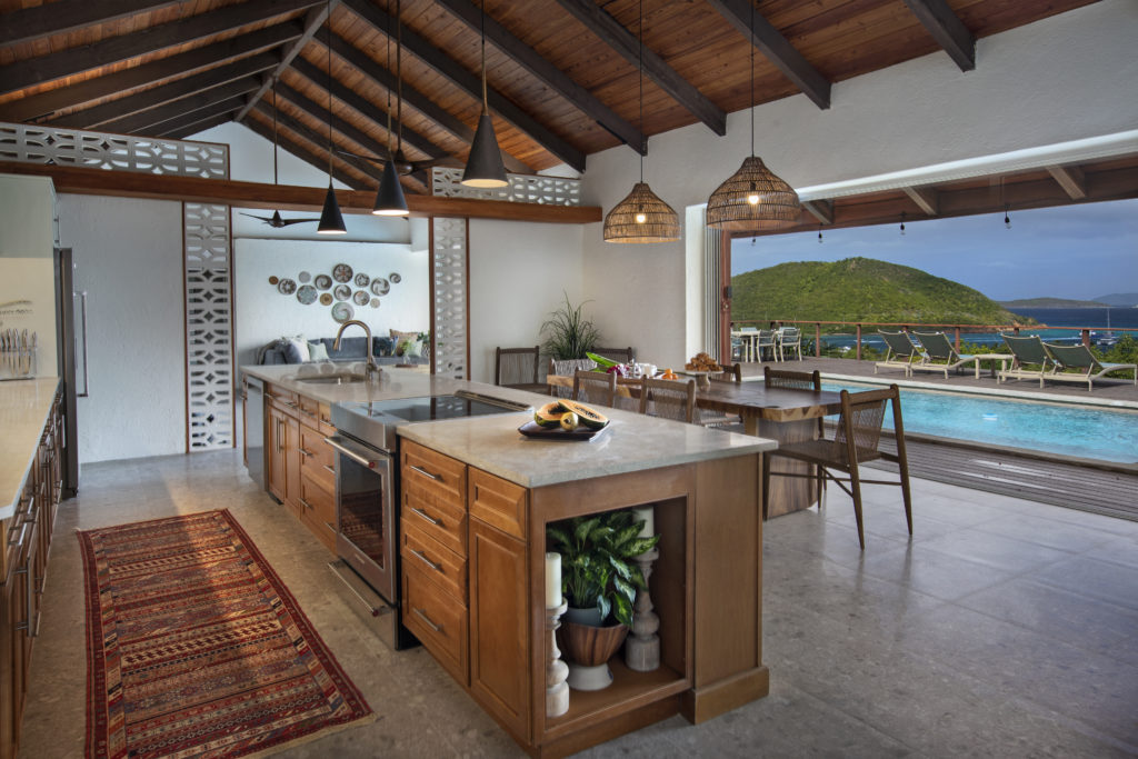
To emphasize the mid-century aspect, we added breeze block to the wall separating the entry and the kitchen. This entry is so large that it really can function as a living room as well.
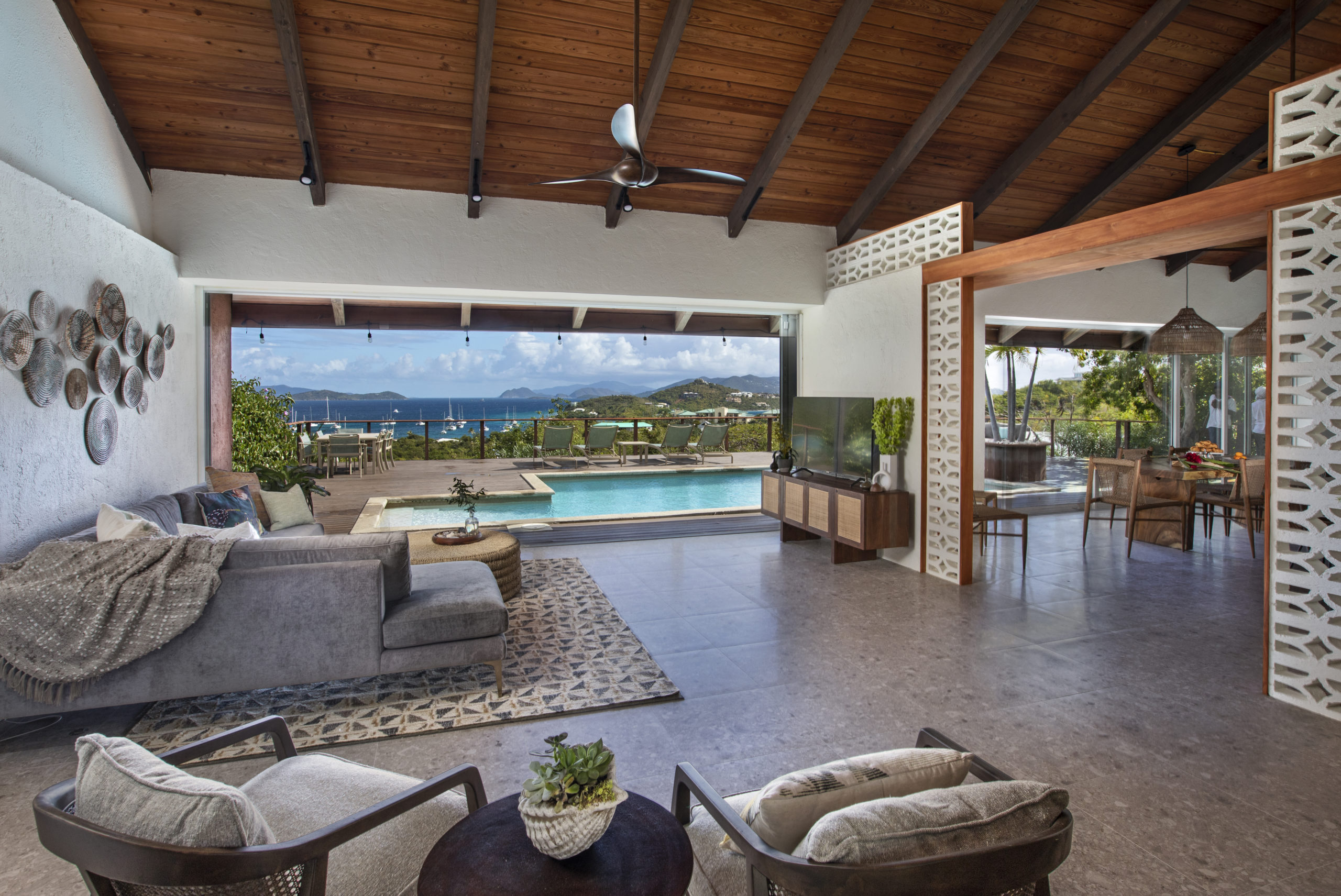
It is now warm and inviting and a great TV watching space.
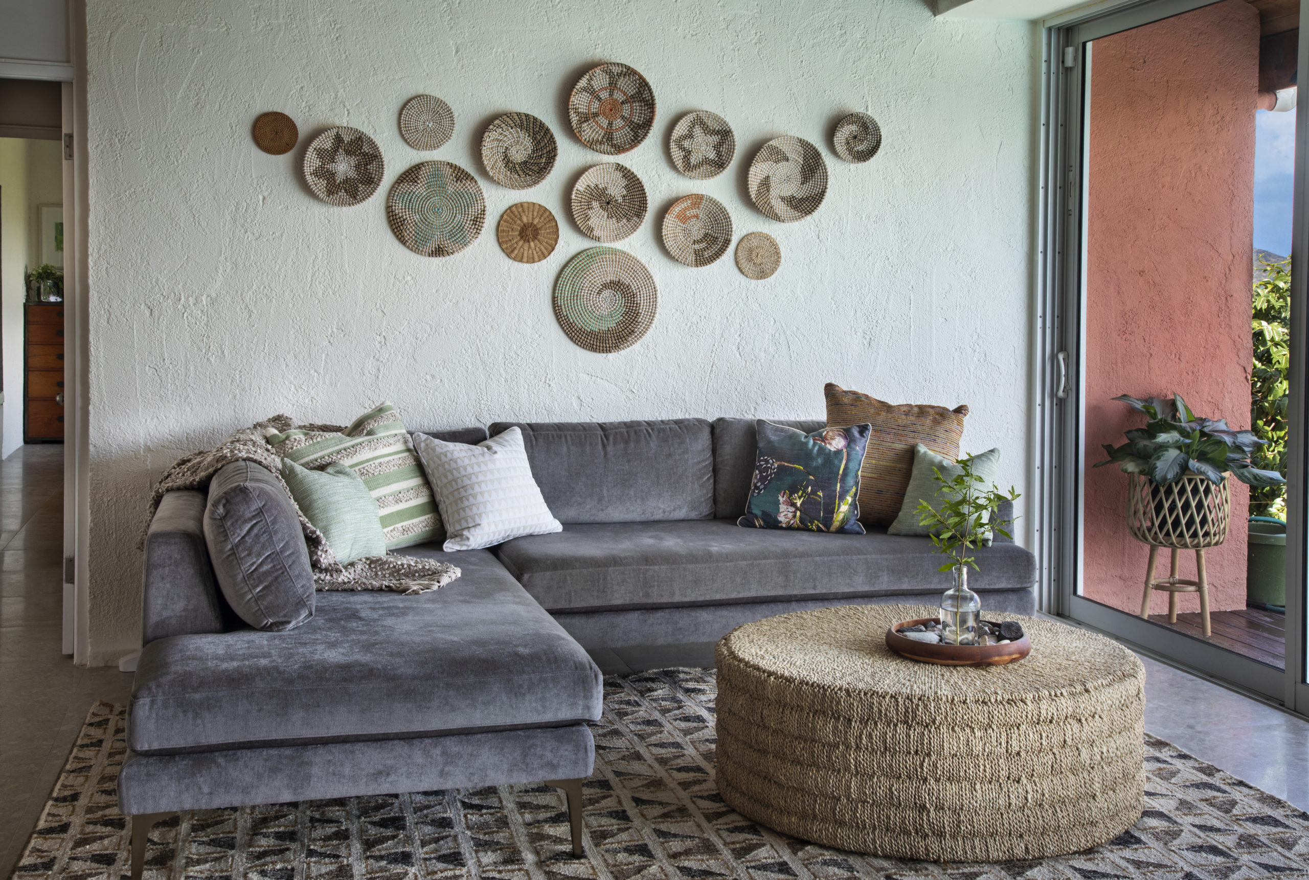
Here’s another shot of the seating area. I love that our client had these baskets as part of her collection already. The woven ottoman and textural jute rug completed the look so well.
Next, Moving on to the Kitchen
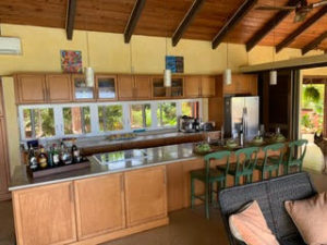
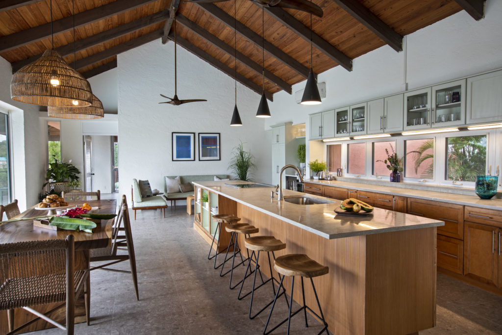
The kitchen got a makeover without totally replacing it. Most of the cabinets were in perfect condition and the countertops just need to be polished and resealed, but it wasn’t really speaking to our mid-century vibe.
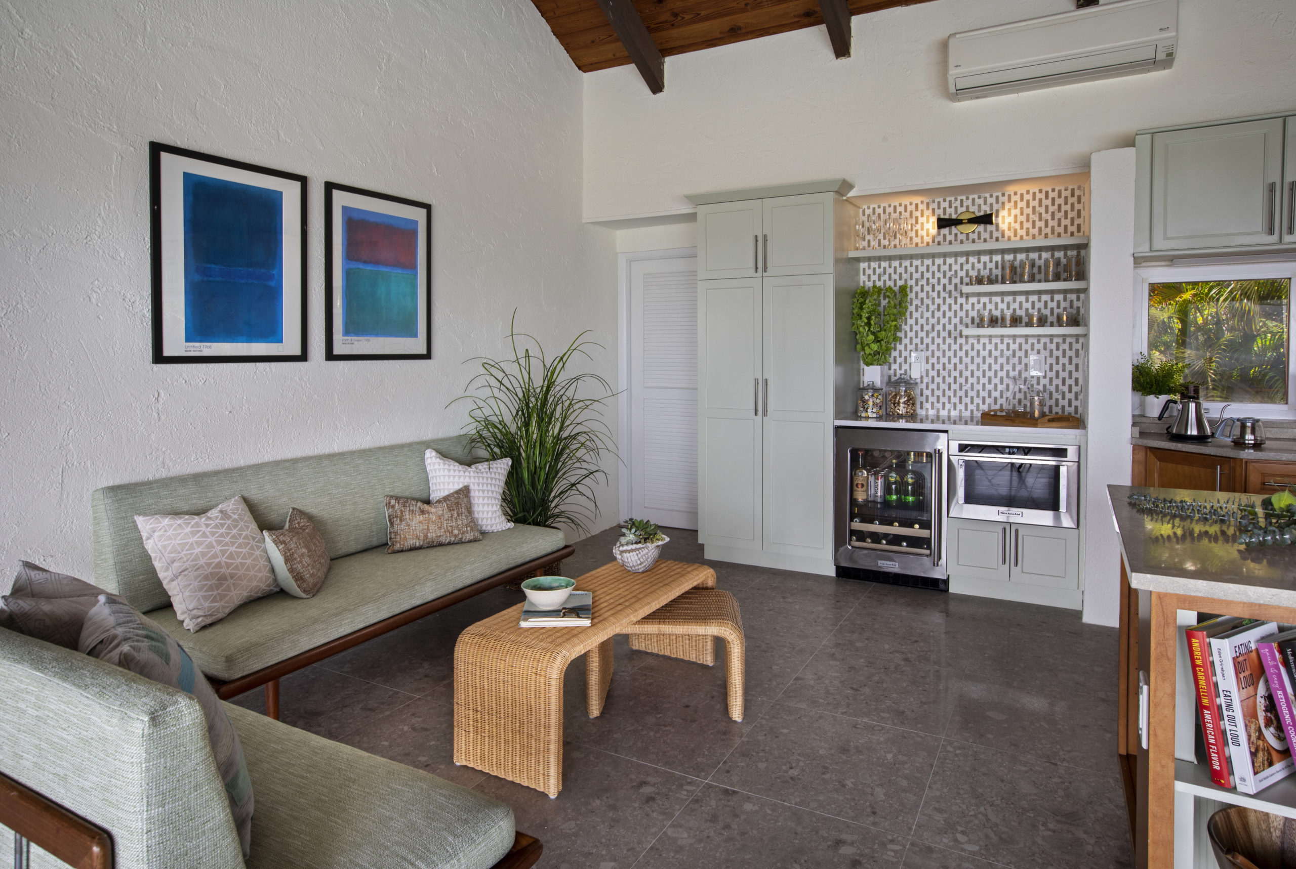
So, we took some of the doors off the island cabinets to create open shelf space for cookbooks, etc. The bar area was wrapped in reeded paneling that was stained to match the existing. Then, we painted the uppers a sage green color. The lighting was updated with fixtures that work with our mid-century/tropical vibe.
One of the best additions to this space was the new bar area. I love the way this came together with the sage green cabinets, geometric backsplash, and can we talk about that sofa. It’s an original period piece that our client has had for years. It was recovered in indoor-outdoor fabric in preparation for its new home and the great indoor-outdoor living this house provides.
Redecorating the Master Bedroom Suite
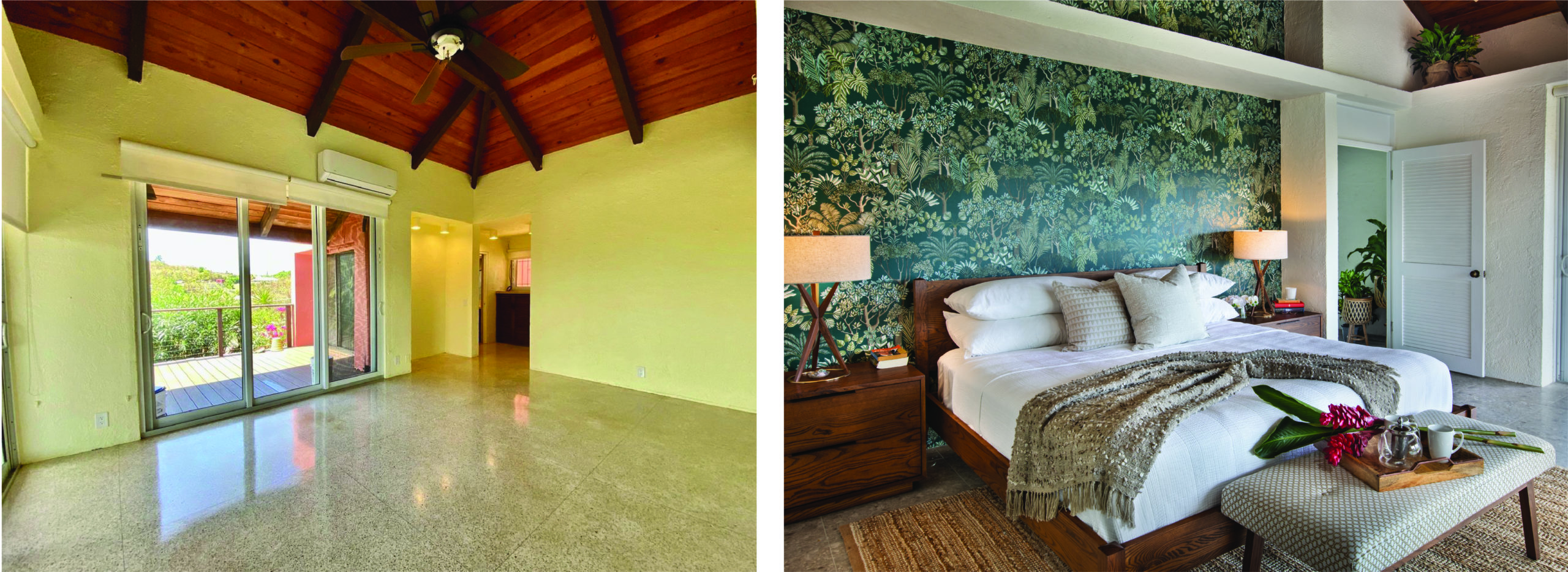
In the master suite, we styled the bedroom with new furniture and a wallpaper accent wall to add some color.
The bathroom really got a makeover. The existing vanity stayed and was refreshed with new a countertop, sinks, and plumbing fixtures, but the cabinet was solid mahogany made locally. So, we definitely didn’t want to say goodbye to that item!
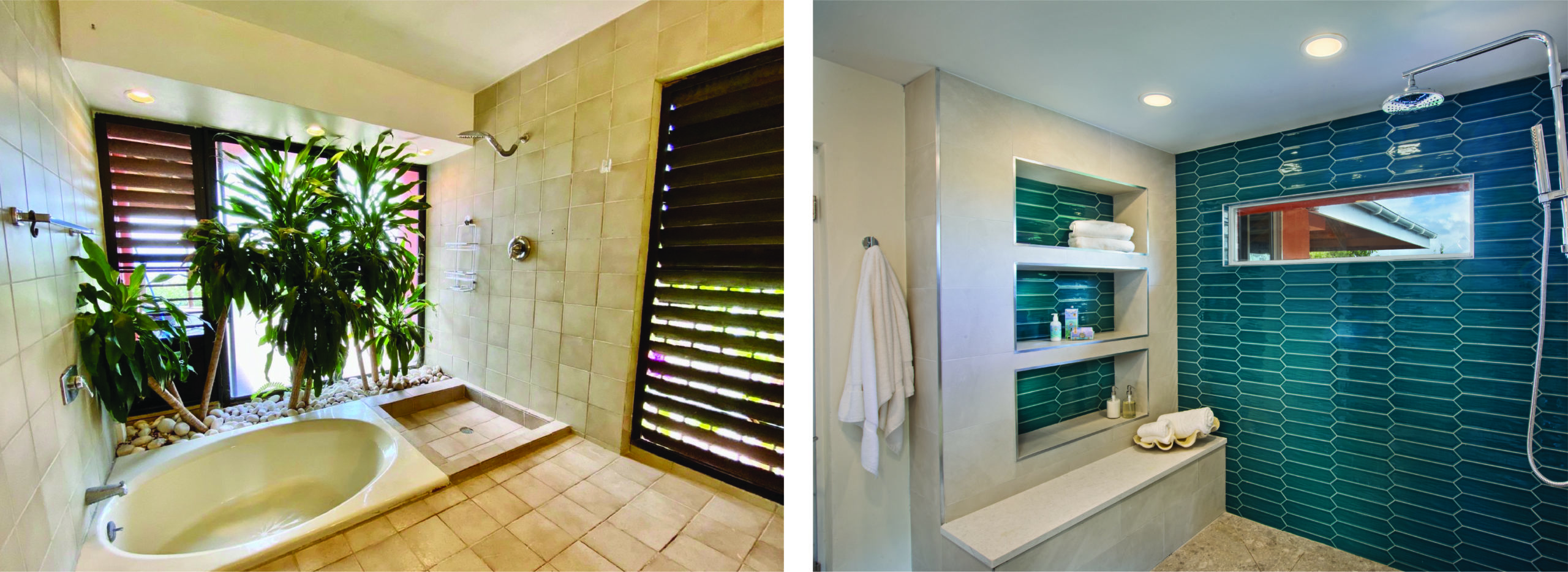
We LOVE the way this bathroom turned out with its spacious shower and lots of storage. We did away with the planter in the shower area. While charming, it has the potential to attract bugs, and we have enough issues with that in our tropical climate as it is. No need to encourage them!
Be Our Guest in these Newly Refreshed Rooms
In the guest rooms, we just changed the paint and furniture. Sometimes that can make a HUGE difference!
Guest Room #1:
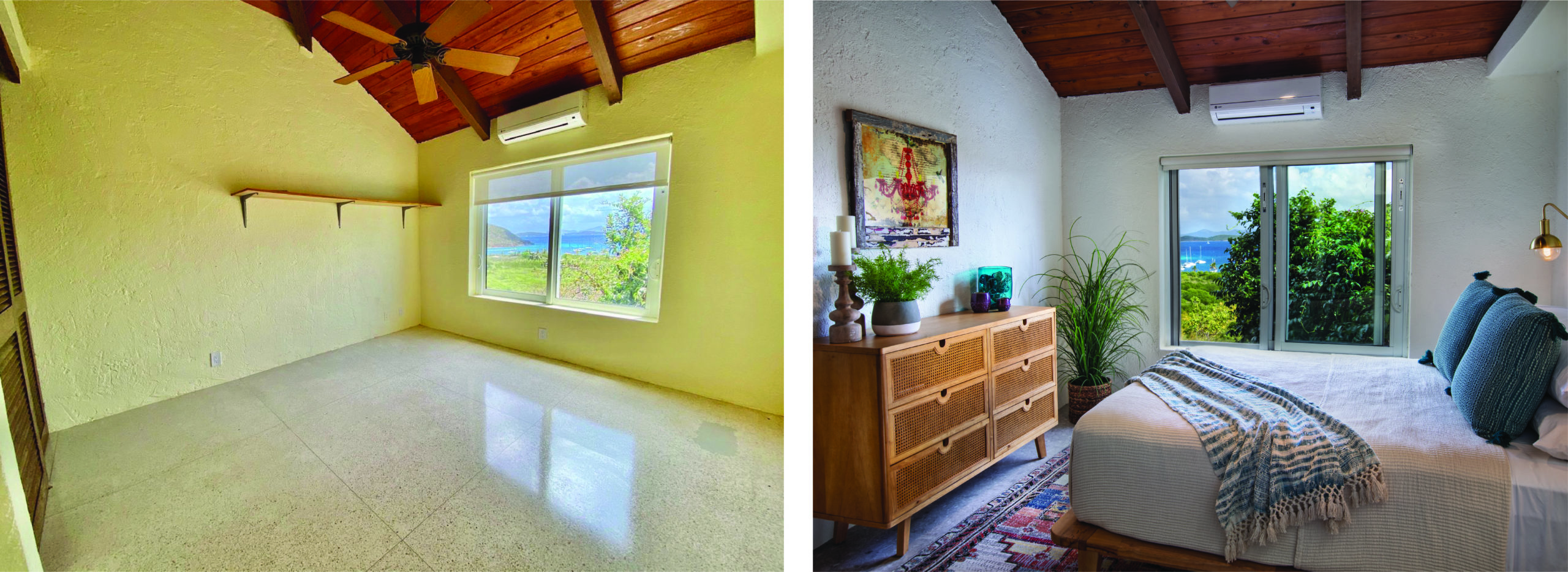
Guest Room #2:
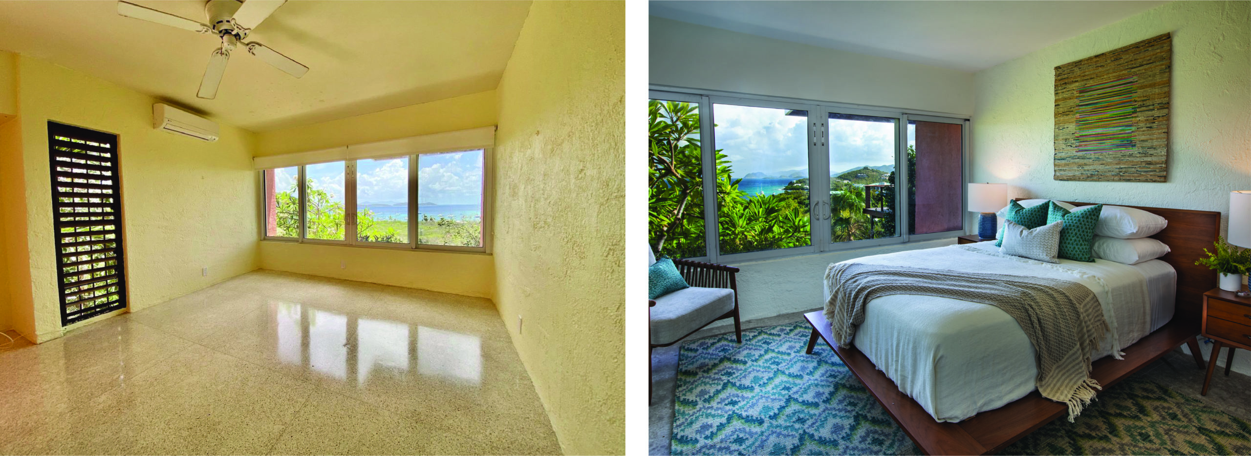
Guest Baths:
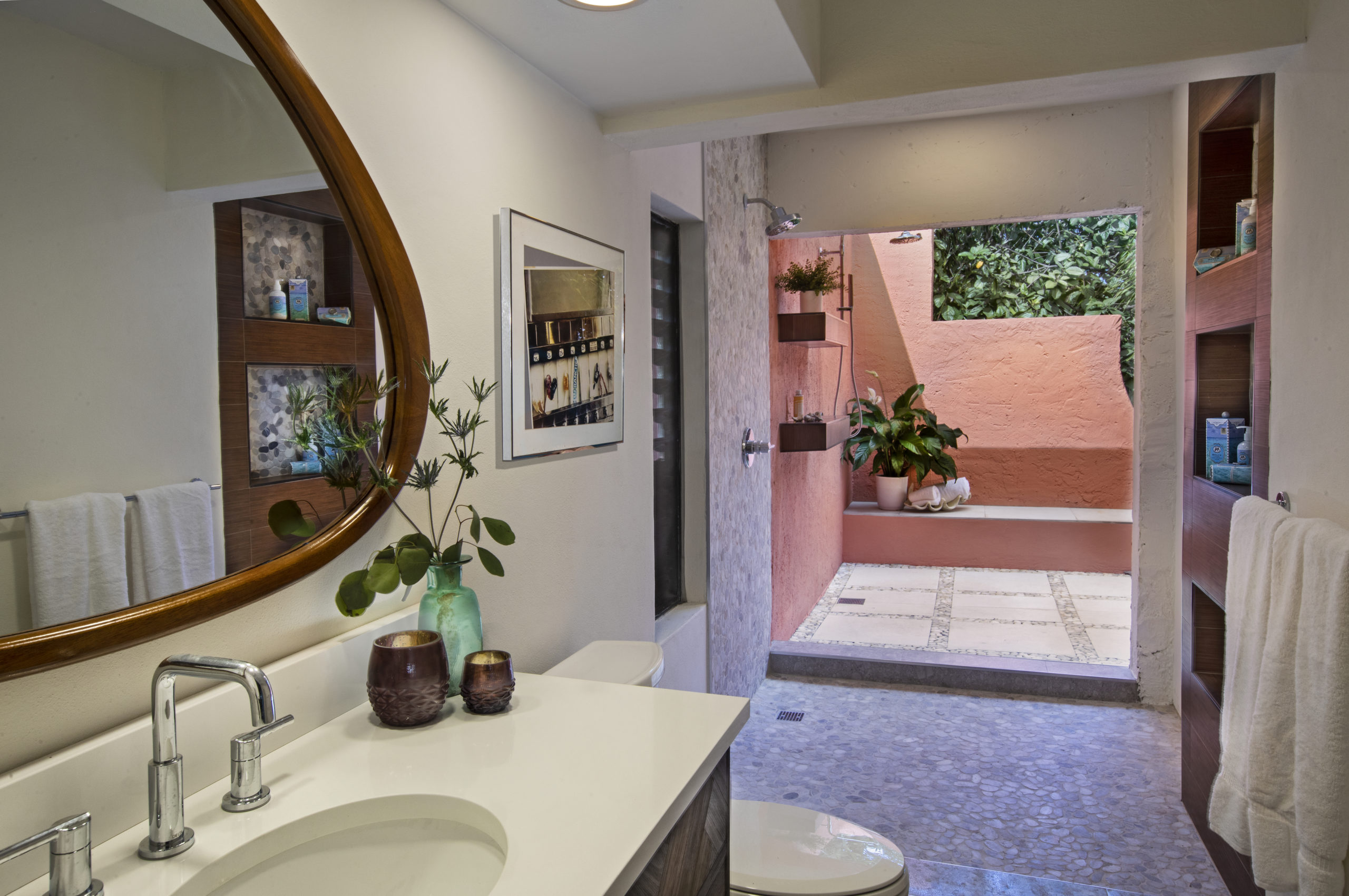
The guest bathroom got a huge makeover. It has basically doubled in size and now includes indoor and outdoor bathing areas, as well as lots of natural light. While this bathroom certainly serves the purpose, we decided to connect it to the very private patio space behind the bathroom. This way the indoor-outdoor feel of the home is continued, and our homeowners’ guests can enjoy the full experience of the tropical climate.
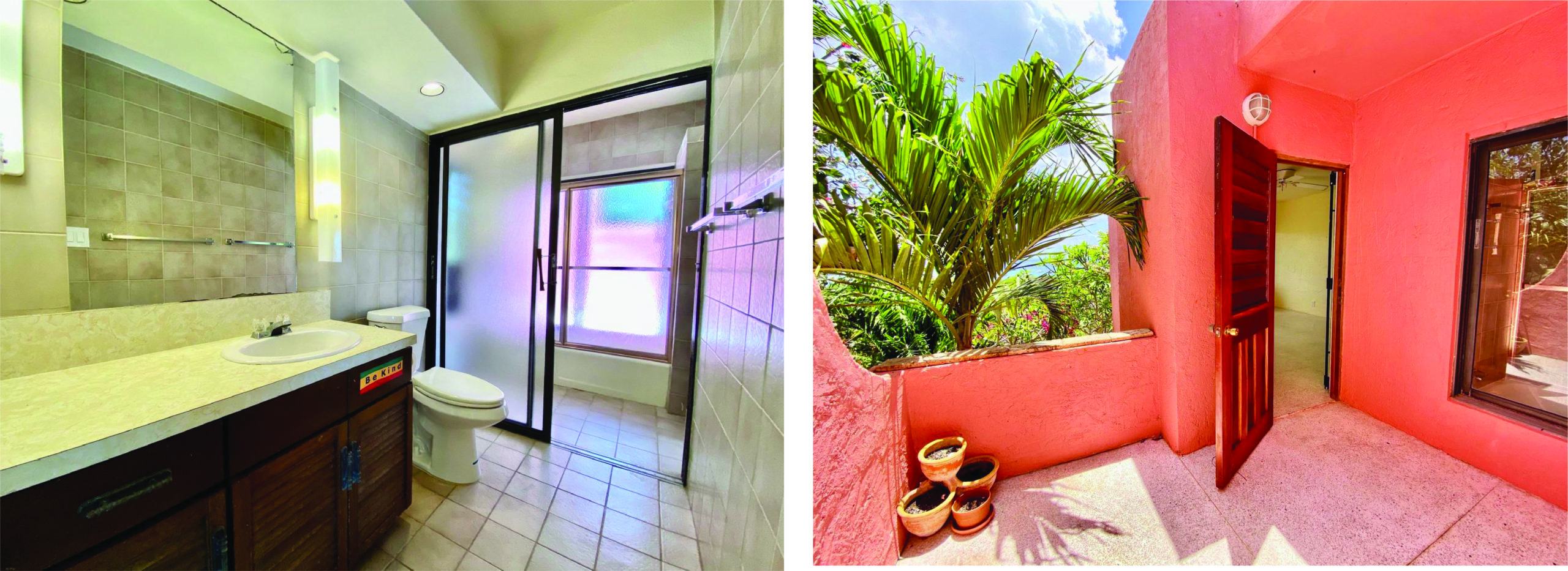
This door between the guest bedroom and bathroom was rarely ever used and presented the potential for lack of privacy with that big slider in the shower right there. The door was removed to ensure privacy of the indoor-outdoor shower experience.
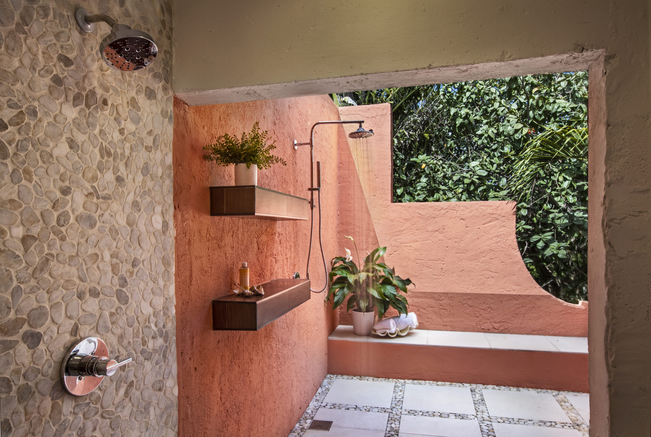
Pebbles and pavers make the surfaces easy to clean and give an organic feel. The shelves are constructed of porcelain wood, so they will stand up to the outdoor elements.
Let Us Entertain You Outside
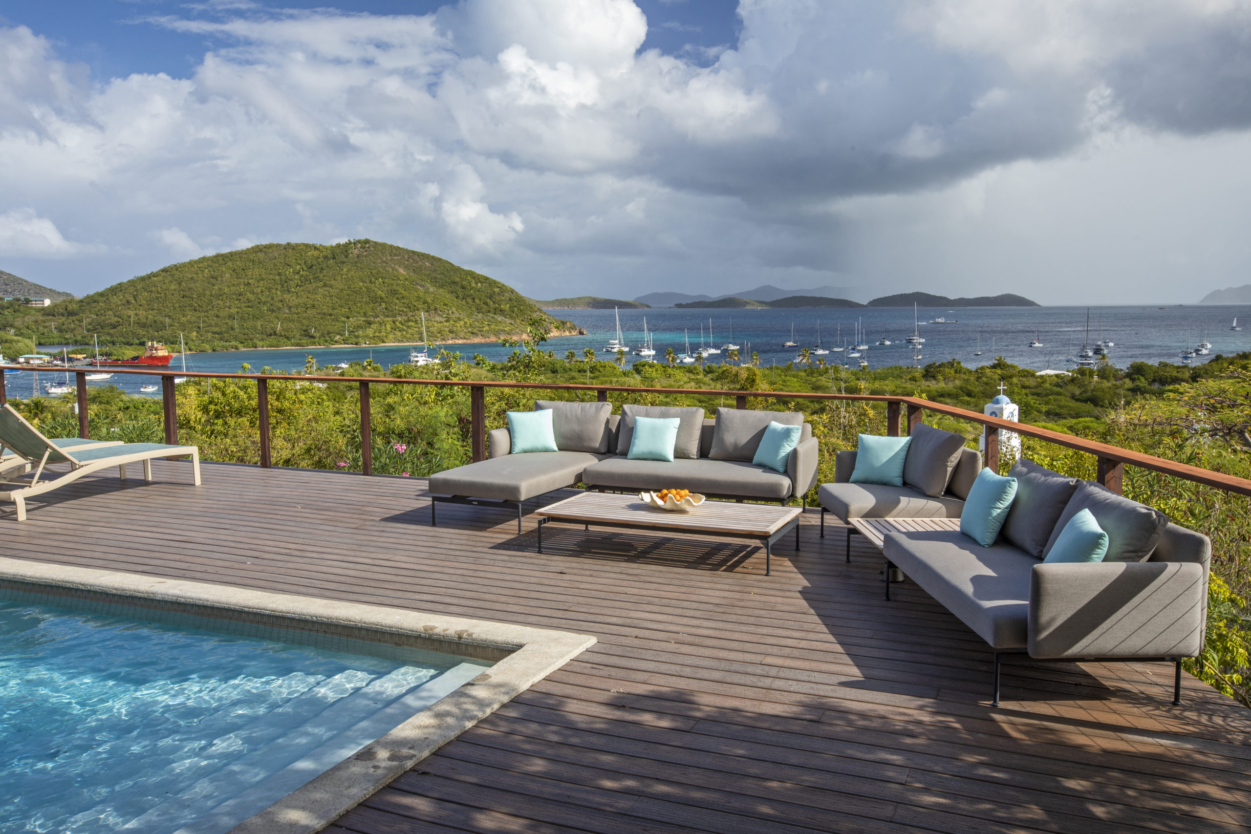
One of the most important areas of the home is the outdoor deck around the pool where we added new custom furnishing to create a great entertaining space.
Work from Anywhere, but Especially Here
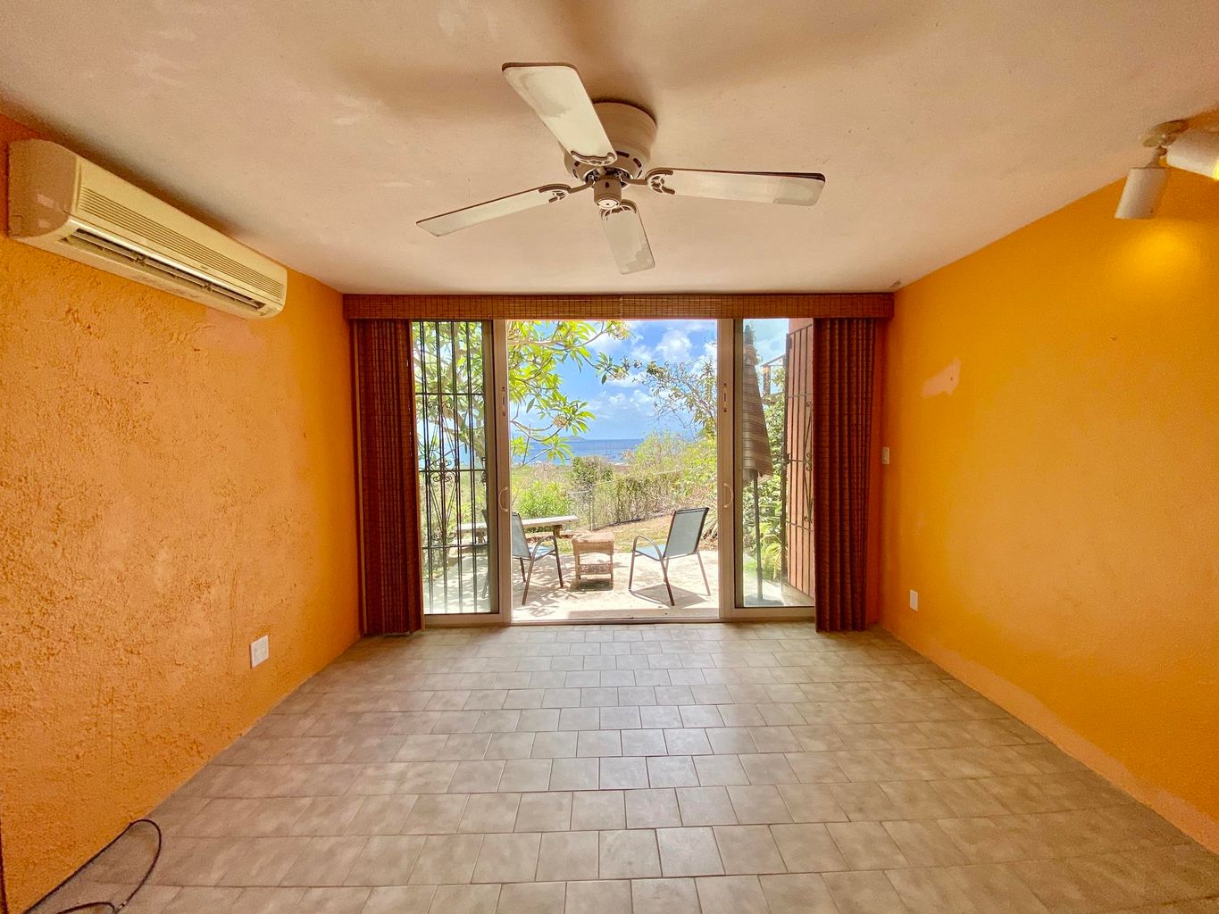
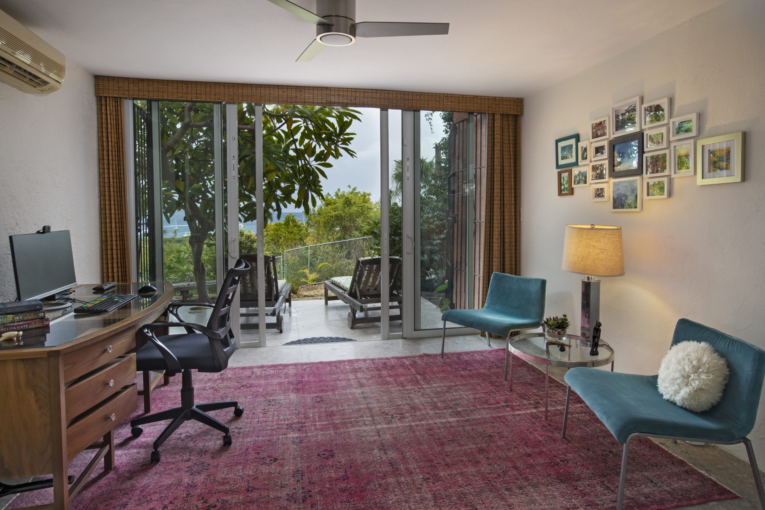
And last but not least, the home office! Work from home is a wonderful thing when you can enjoy this view every day! This was mostly just a matter of paint and furniture again.
This bright and cheery space makes a great zoom background!








What a gorgeous transformation, Tiffany! So many thoughtful details that take this makeover to the next level!
Tiffany –
Wow! This is such a beautiful before & after transformation. I loved learning about the thoughtful use of materials you selected for your client – materials that assured her of longevity and ease of maintenance and safety.
Tiffany this was an exceptional makeover, I love all the textural elements you added and the new color palette absolutely perfect. Thanks for sharing this post, it was a real pleasure to read!