BLAST FROM THE PAST
Lately, I’ve been binge-watching the Marvelous Mrs. Maisel and it has me thinking about the architectural details in interiors that have all but become a thing of the past.
The scenes of the pre-war era apartment buildings in New York are so intriguing. New Yorkers have really perfected the art of gracious small-space living, long before that became a thing. There are a lot of little lessons that one can adapt from those vintage apartments.
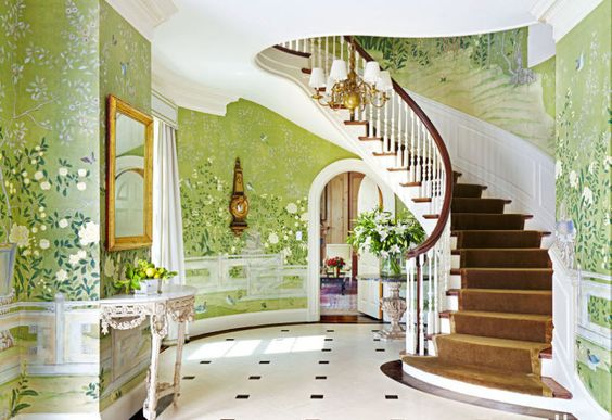
How about those scenes where the apartment would conserve a lovely phone nook – talk about things that we no longer have!
LOST BUT NOT FORGOTTEN
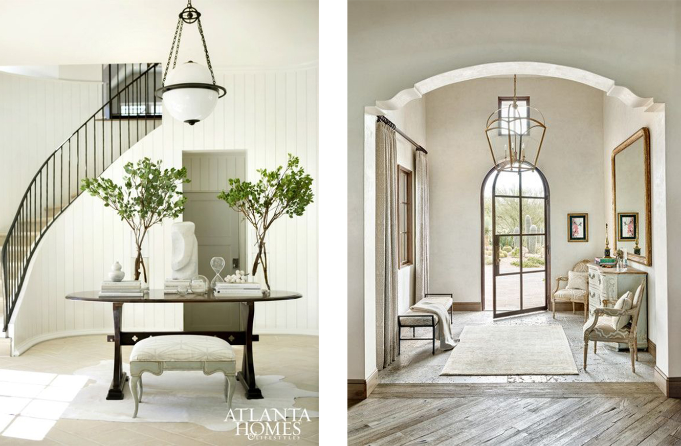
It’s really the entry foyers that I love. Those have been lost a bit in the modern times of open concept living. What a gracious way to welcome guests to your home. Much like a party invitation, the design should foreshadow the theme of the gathering with its color scheme and graphics. The same can be said for foyers, where a little taste of what is yet to come is tucked away further inside the home.
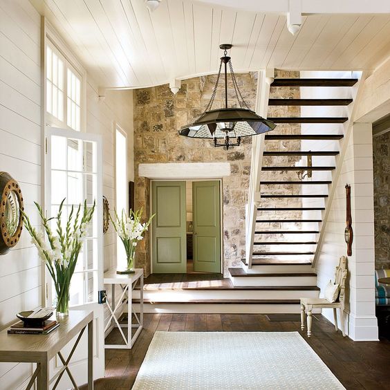
There are some places where you open the front door, step inside, and hello – you are now smack dab in the middle of the living room. When a package is brought to your door or the girl scouts stop by with cookies, do they really need to be in the living area? I feel that it is so much more civil to have that little space between your primary living space and the front door. This smaller area is easy to keep tidy, even if your kitchen and living room are being over run by your kids and their friends eating popcorn. If other parts of your home look like a bomb went off… the pop-in guest doesn’t necessarily need to see that!
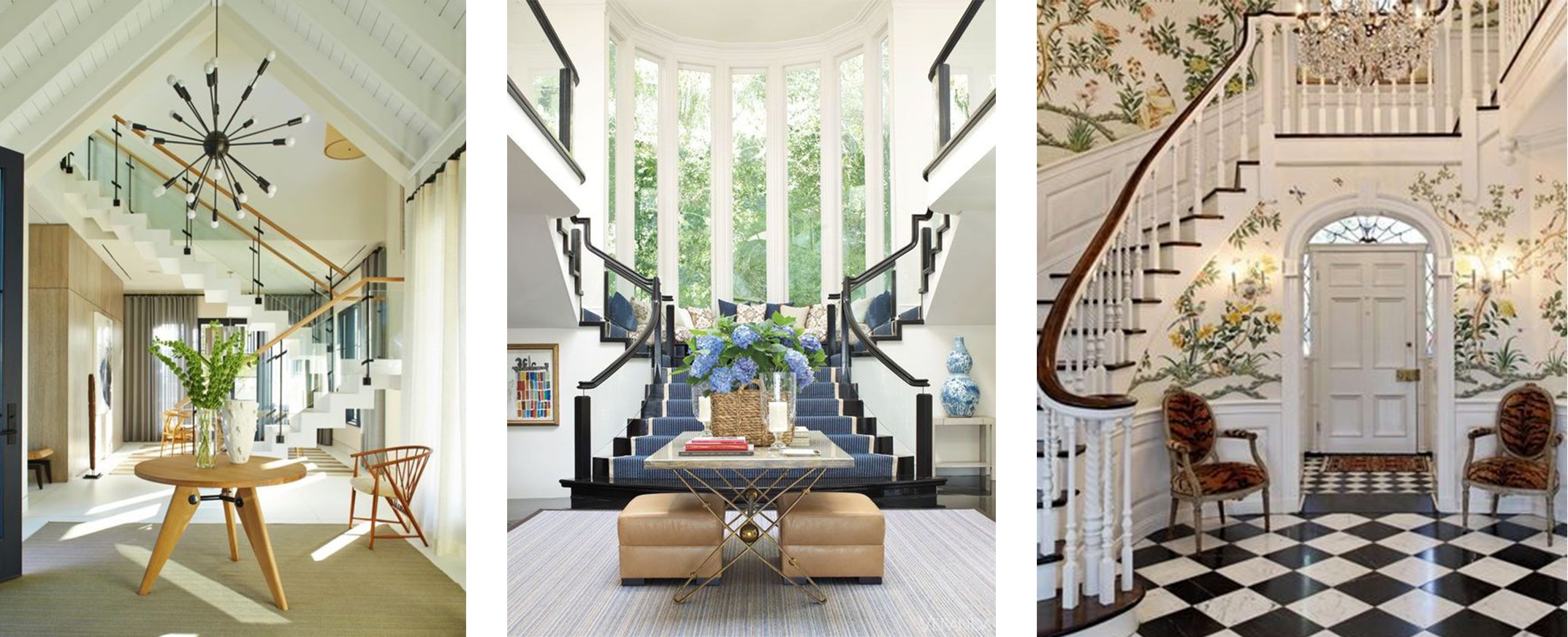
Here are some of our favorite first impressions in these elegant homes.
Foyer related resources.
Architectural Digest
Haute Residence
Coco Dsgn
Southern Living


